
Music is not only remembered through sound.
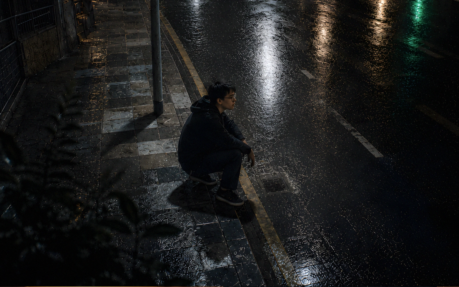
Someone might forget the chord progression, the exact drum pattern, or the shape of a synth line, but still remember an image: a half lit street, a blurred cover, a worn texture, a face in shadow, a green light, a repeated symbol, a scene that feels like it came from a strange dream.
That also becomes part of the song.
Not as decoration. More like an extension of the atmosphere. An image can hold what the sound leaves floating. It can give shape to an emotion that does not have a name yet. It can keep a song from feeling like another file lost between hundreds of posts.
For an independent artist, that matters. A song can disappear quickly when it arrives alone, without a world around it. But when it carries a clear visual identity, even a minimal one, it begins to leave a mark that is easier to recognize.
The image becomes a kind of echo.
A SONG NEEDS A VISUAL SIGNAL
Every release leaves a signal, even when it is not planned carefully.
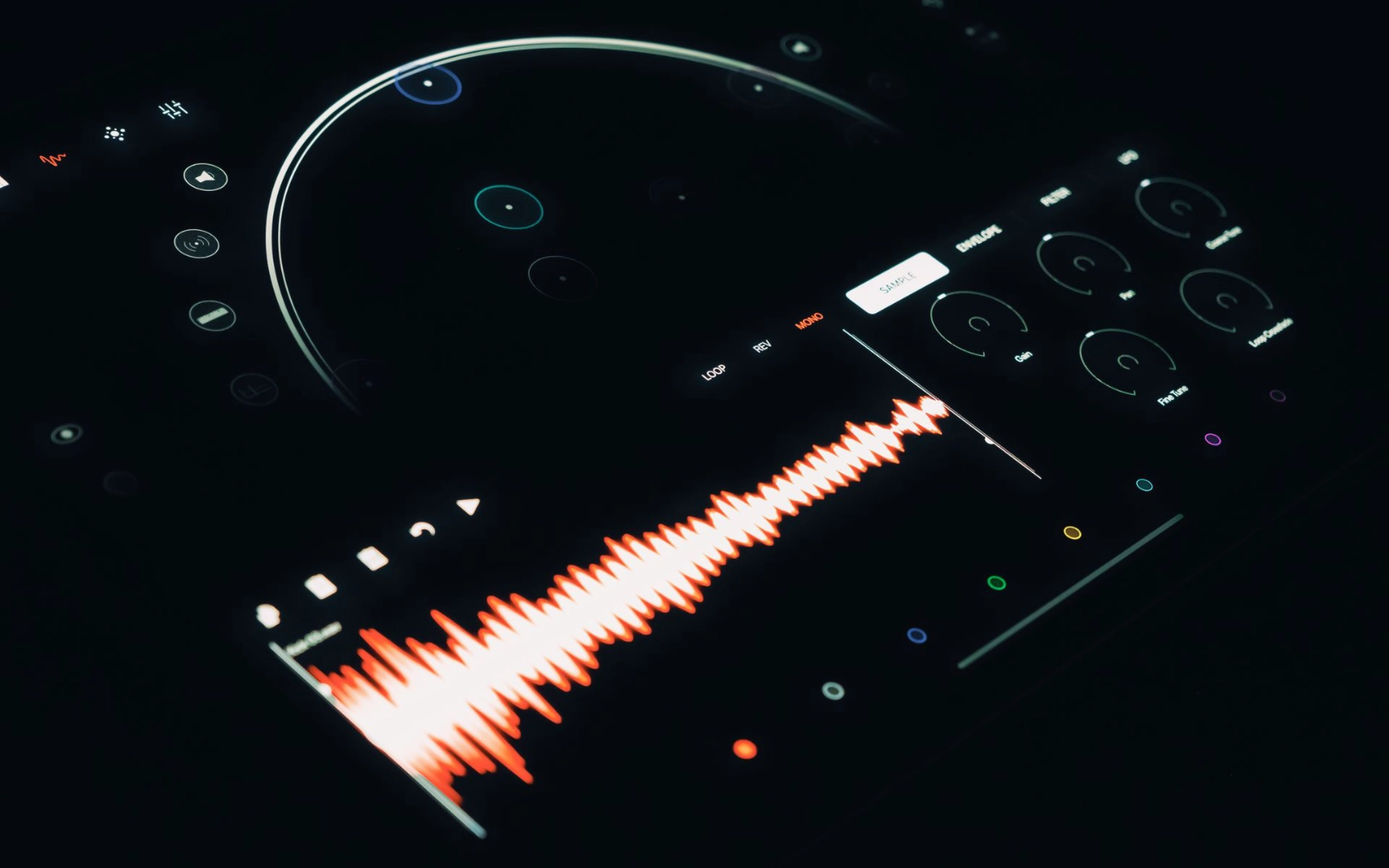
It can be a color palette, a cover, a texture, a type of light, a typeface, a symbol, a short video, a processed photo, a visualizer, or a specific way of showing the song title.
When all of that changes without direction, the project becomes harder to remember. Not because every image has to look the same, but because something should return: a similar tension, a recognizable atmosphere, a language that slowly starts to feel like its own.
Dark visuals work well here because they can carry mystery, nostalgia, beauty, anxiety, noise, calm, and threat without explaining everything. They can suggest more than they show. Many songs need exactly that.

VISUAL IDENTITY GIVES MUSIC A PLACE TO LIVE
A song becomes easier to remember when it feels like it comes from somewhere.
That place can be real or imagined: a low lit room, a wet city, an abandoned station, a digital archive, an industrial landscape, a night road, a damaged screen, a memory that no longer looks clean.
What matters is the feeling of belonging.
When music, images, colors, words, and texture point in the same direction, the project stops feeling like a collection of loose pieces. It starts to have territory.
A single, a reel, a blog image, a visualizer, and a downloadable resource can speak the same language without repeating the exact same formula.
Consistency does not have to be rigid. It can be a returning stain, a recurring light, a frame, a type of grain, a way of using silence, or the shape of empty space.
IN SHORT FORM CONTENT, THE IMAGE ARRIVES FIRST
On TikTok, Reels, Shorts, and Pinterest, people decide quickly.
The image often arrives before the song. Before someone understands the lyric or the sound, they already received a visual impression. If that impression feels generic, it gets lost. If it has something recognizable, even something small, it can open a door.
It does not need to scream visually. Many times the strongest thing is what feels contained: a still scene, a strange texture, a light that does not look clean, a frame that leaves more questions than answers.
Short form content works better when each piece feels connected to something larger. A loop, a visualizer, a still image with minimal motion, or an instrumental fragment can act like a signal. It does not have to explain everything. It only needs to leave enough tension for someone to come back.
VISUAL RESOURCES CAN ALSO OPEN DOORS
A resource does not have to be only a downloadable file.
It can be an entry point.
Someone may arrive looking for an image for a cover, a texture for a video, an atmosphere for a moodboard, or a reference for a personal project. Maybe they do not arrive through the music first. Maybe they arrive through an image. That also counts.
Free or paid resources can help other creators while creating a wider connection with the work behind them. It does not need to become a heavy strategy. The material just needs intention, taste, and a clear direction.
When a visual resource is well presented, it can live in more than one place: a website, a blog, Pinterest, a shop, a post, a short video, or a reference sent to another artist. Each point can become a different door into the same kind of sensitivity.
IT IS NOT ABOUT LOOKING BIGGER
Independent artists often feel pressure to look like a finished brand before they even know what they are building.
There is no need to fake scale.
Sometimes it is enough to repeat a few decisions with intention: a limited palette, a specific texture, a way of using shadows, a visual rhythm between covers and posts, a secondary typeface, a small symbol that starts appearing in different places.
That can be stronger than publishing many images that do not belong to each other.
Identity is not built all at once. It accumulates. One piece does not say much yet. Five pieces begin to form a pattern. Ten pieces can start feeling like a world.
What matters is that every visual decision does not look like it was made from zero. There should be memory between one image and the next.
MEMORY IS BUILT THROUGH REPETITION
People remember what returns.
A color returns.
A texture returns.
A symbol returns.
A phrase returns.
A type of light returns.
A feeling returns.
Over time, those repetitions create identity. Not in an obvious or forced way, but like certain songs you recognize before the voice enters. Something in the atmosphere already tells you where it belongs.
Dark visuals have a special advantage: they leave space for mystery. They do not deliver everything. They do not close the interpretation too early. They let the listener complete part of the scene.
And when someone completes something on their own, they are more likely to remember it.
What Stays After the Scroll
Music can live alone, but it is rarely discovered alone.
A song appears surrounded by images, titles, thumbnails, fragments, posts, colors, textures, and small visual decisions. All of that affects the way someone perceives it before, during, and after listening.
Dark visuals do not make a song better by themselves, but they can help its atmosphere last longer in memory.
For an independent project, that memory matters.
Explore useful free and premium resources for dark visuals, atmospheric projects, and creative experiments.
La música no se recuerda solo por el sonido.
Alguien puede olvidar la progresión de acordes, el patrón exacto de la batería o la forma de una línea de sintetizador, pero seguir recordando una imagen: una calle medio iluminada, una portada borrosa, una textura gastada, un rostro en sombra, una luz verde, un símbolo repetido, una escena que parece venir de un sueño extraño.
Eso también se vuelve parte de la canción.
No como decoración. Más bien como una extensión de la atmósfera. Una imagen puede sostener lo que el sonido deja flotando. Puede darle forma a una emoción que todavía no tiene nombre. Puede evitar que una canción se sienta como otro archivo perdido entre cientos de posts.
Para un artista independiente, eso importa. Una canción puede desaparecer rápido cuando llega sola, sin un mundo alrededor. Pero cuando trae una identidad visual clara, aunque sea mínima, empieza a dejar una marca más fácil de reconocer.
La imagen se vuelve una especie de eco.
UNA CANCIÓN NECESITA UNA SEÑAL VISUAL
Cada lanzamiento deja una señal, incluso cuando no se planea con cuidado.
Puede ser una paleta de color, una portada, una textura, un tipo de luz, una tipografía, un símbolo, un video corto, una foto procesada, un visualizer o una forma específica de mostrar el título de la canción.
Cuando todo eso cambia sin dirección, el proyecto se vuelve más difícil de recordar. No porque cada imagen tenga que verse igual, sino porque algo debería regresar: una tensión similar, una atmósfera reconocible, un lenguaje que poco a poco empiece a sentirse propio.
Los visuales oscuros funcionan bien aquí porque pueden cargar misterio, nostalgia, belleza, ansiedad, ruido, calma y amenaza sin explicarlo todo. Pueden sugerir más de lo que muestran. Muchas canciones necesitan exactamente eso.
LA IDENTIDAD VISUAL LE DA A LA MÚSICA UN LUGAR DONDE VIVIR
Una canción se vuelve más fácil de recordar cuando parece venir de algún lugar.
Ese lugar puede ser real o imaginado: una habitación con poca luz, una ciudad mojada, una estación abandonada, un archivo digital, un paisaje industrial, una carretera de noche, una pantalla dañada, una memoria que ya no se ve limpia.
Lo importante es la sensación de pertenencia.
Cuando la música, las imágenes, los colores, las palabras y la textura apuntan en la misma dirección, el proyecto deja de sentirse como una colección de piezas sueltas. Empieza a tener territorio.
Un single, un reel, una imagen de blog, un visualizer y un recurso descargable pueden hablar el mismo idioma sin repetir exactamente la misma fórmula.
La consistencia no tiene que ser rígida. Puede ser una mancha que vuelve, una luz recurrente, un encuadre, un tipo de grano, una forma de usar el silencio o la silueta del espacio vacío.
EN EL CONTENIDO CORTO, LA IMAGEN LLEGA PRIMERO
En TikTok, Reels, Shorts y Pinterest, la gente decide rápido.
La imagen muchas veces llega antes que la canción. Antes de que alguien entienda la letra o el sonido, ya recibió una impresión visual. Si esa impresión se siente genérica, se pierde. Si tiene algo reconocible, aunque sea pequeño, puede abrir una puerta.
No necesita gritar visualmente. Muchas veces lo más fuerte es lo contenido: una escena quieta, una textura extraña, una luz que no se ve limpia, un encuadre que deja más preguntas que respuestas.
El contenido corto funciona mejor cuando cada pieza se siente conectada a algo más grande. Un loop, un visualizer, una imagen fija con movimiento mínimo o un fragmento instrumental pueden funcionar como señal. No tienen que explicarlo todo. Solo necesitan dejar suficiente tensión para que alguien vuelva.
LOS RECURSOS VISUALES TAMBIÉN PUEDEN ABRIR PUERTAS
Un recurso no tiene que ser solo un archivo descargable.
Puede ser un punto de entrada.
Alguien puede llegar buscando una imagen para una portada, una textura para un video, una atmósfera para un moodboard o una referencia para un proyecto personal. Tal vez no llega por la música primero. Tal vez llega por una imagen. Eso también cuenta.
Los recursos gratuitos o pagos pueden ayudar a otros creadores mientras crean una conexión más amplia con el trabajo detrás de ellos. No hace falta convertirlo en una estrategia pesada. El material solo necesita intención, gusto y una dirección clara.
Cuando un recurso visual está bien presentado, puede vivir en más de un lugar: una web, un blog, Pinterest, una tienda, un post, un video corto o una referencia enviada a otro artista. Cada punto puede convertirse en una puerta distinta hacia la misma sensibilidad.
NO SE TRATA DE VERSE MÁS GRANDE
Los artistas independientes suelen sentir presión por verse como una marca terminada antes de saber realmente qué están construyendo.
No hace falta fingir escala.
A veces basta con repetir algunas decisiones con intención: una paleta limitada, una textura específica, una forma de usar sombras, un ritmo visual entre portadas y posts, una tipografía secundaria, un símbolo pequeño que empieza a aparecer en distintos lugares.
Eso puede ser más fuerte que publicar muchas imágenes que no pertenecen entre sí.
La identidad no se construye de golpe. Se acumula. Una pieza todavía no dice mucho. Cinco piezas empiezan a formar un patrón. Diez piezas pueden empezar a sentirse como un mundo.
Lo importante es que cada decisión visual no parezca hecha desde cero. Debería haber memoria entre una imagen y la siguiente.
LA MEMORIA SE CONSTRUYE CON REPETICIÓN
La gente recuerda lo que vuelve.
Vuelve un color.
Vuelve una textura.
Vuelve un símbolo.
Vuelve una frase.
Vuelve un tipo de luz.
Vuelve una sensación.
Con el tiempo, esas repeticiones crean identidad. No de una forma obvia o forzada, sino como ciertas canciones que reconoces antes de que entre la voz. Algo en la atmósfera ya te dice a dónde pertenece.
Los visuales oscuros tienen una ventaja especial: dejan espacio para el misterio. No entregan todo. No cierran la interpretación demasiado pronto. Dejan que quien escucha complete parte de la escena.
Y cuando alguien completa algo por su cuenta, es más probable que lo recuerde.
Lo que queda después del scroll
La música puede vivir sola, pero rara vez se descubre sola.
Una canción aparece rodeada de imágenes, títulos, thumbnails, fragmentos, posts, colores, texturas y pequeñas decisiones visuales. Todo eso afecta la forma en que alguien la percibe antes, durante y después de escucharla.
Los visuales oscuros no hacen que una canción sea mejor por sí solos, pero pueden ayudar a que su atmósfera dure más tiempo en la memoria.
Para un proyecto independiente, esa memoria importa.
Explora recursos gratuitos y premium para visuales oscuros, proyectos atmosféricos y experimentos creativos.